How to Optimize Content for Mobile Users: Top Tips for 2025
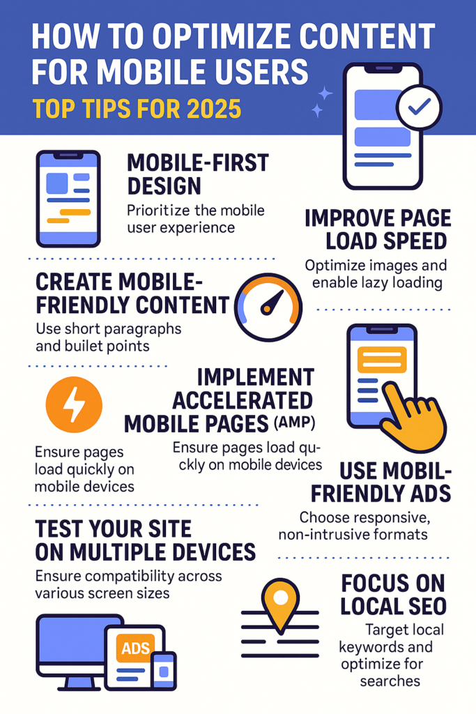
Optimize Content for Mobile Users In the world of digital marketing, one thing is clear: mobile usage is dominating the internet. According to recent statistics, over half of global web traffic now comes from mobile devices. If you’re not optimizing your content for mobile users, you’re missing out on a huge audience. In this blog, we’ll discuss how you can make sure your content is mobile-friendly and delivers the best experience for your users. 1. Prioritize Mobile-First Design Mobile-first design is a web design philosophy that prioritizes the mobile user experience before designing for desktop. This approach ensures your site’s functionality and content are optimized for smaller screens. A mobile-first approach doesn’t just improve the user experience; it also plays a vital role in SEO, as Google now uses mobile-first indexing. This means Google evaluates the mobile version of your site for ranking. Key Tips for Mobile-First Design: 2. Improve Page Load Speed Mobile users are typically on the go, and they don’t have time to wait for slow-loading websites. A delay of even a few seconds can cause users to bounce off your site. Page speed is also a ranking factor in Google’s algorithm, so improving your load time can boost your SEO. Tips to Boost Mobile Page Speed: 3. Create Mobile-Friendly Content Content is key to keeping users engaged, but it needs to be optimized for mobile viewing. Long paragraphs and large blocks of text can overwhelm mobile users. To ensure your content is mobile-friendly, aim to make it easy to digest and visually appealing. Mobile-Friendly Content Tips: 4. Optimize for Touchscreen Interaction Mobile users interact with your website using their fingers, not a mouse. Therefore, it’s important to ensure that buttons and interactive elements are easy to click and don’t require precision tapping. Tips for Touchscreen Optimization: 5. Implement Accelerated Mobile Pages (AMP) Accelerated Mobile Pages (AMP) is a technology that allows you to create mobile-optimized content that loads almost instantly. By using AMP, you ensure your content is fast, lightweight, and suitable for mobile devices, improving the user experience. How AMP Helps: 6. Use Mobile-Friendly Ads If you’re using ads as part of your content strategy, ensure they’re optimized for mobile. Intrusive or poorly designed ads can disrupt the mobile user experience, leading to higher bounce rates. Tips for Mobile-Friendly Ads: 7. Test Your Site on Multiple Devices Even if your website looks great on one mobile device, it may not perform well across all of them. Regularly testing your site on different devices and screen sizes helps identify potential issues that may affect the user experience. Mobile Testing Tools: 8. Focus on Local SEO Mobile users often search for businesses and services near them. For this reason, local SEO is especially important for mobile optimization. Ensure your business’s name, address, and phone number (NAP) are consistent across the web, and use location-based keywords to target local customers. Local SEO Tips for Mobile: Conclusion Optimizing your content for mobile users is not just a trend, it’s a necessity. With mobile traffic continuing to rise, providing an exceptional mobile experience will help you increase user engagement, improve your search rankings, and ultimately boost your conversions. Implement these mobile optimization strategies to stay ahead of the competition and create a seamless experience for your mobile audience. By ensuring your website is mobile-friendly, you’re not just keeping up with the times—you’re leading the way in providing an exceptional user experience. For more such content check out more article here Trendify Digital Facebook page: Trendify Digital Instagram Page: Trendify Digital
How to Optimize Content for Mobile Users: Top Tips for 2025 Read More »
Digital Marketing